Noosa Heads
The renovations, topped off with the hand-selected furnishings, transformed this tired apartment to a relaxing, clean-cut destination for holiday-goers to enjoy.
This full coastal apartment renovation involved keeping the floor plan, but updating the function and look of the kitchen, bathrooms and laundry, as well as the flooring and colour palette throughout.
Gallery
Coming red-hot to you with another recently-completed project is the Noosa Heads holiday home!
When our client engaged us to help her transform this tired coastal apartment we leapt at the chance to get our fingers on a project by the beach. Upon our first site visit we were quickly met with popcorn ceilings (yum yum!), bold feature walls, dated lighting fixtures and angled walls - seriously, almost every wall was on a random angle!
As this was purchased by our client as an investment property, with a view to lease out the apartment when not occupied by friends and family, we went in with a smaller renovation in mind with the intention of making a few smaller cosmetic changes to the main living spaces: kitchen, living room and bathrooms. However, the more our client visited the apartment, the more she realised the potential it had and thus came a full apartment renovation.
Being a coastal holiday apartment, we wanted to keep the interior contemporary, light and breezy, drawing inspiration for the colour palette from the lush tropical garden surrounds and the ocean views of the nearby Noosa North Shore. Although the scope of the project changed dramatically from the initial brief, we wanted to provide smart and considered choices that provided a value-add for this investment property without blowing the budget.
The Kitchen Makeover
The main space we wanted to focus on was the kitchen - the hub of the apartment. First thing's first: the green tiles, green laminate, servery and wall partition had to go! We also felt the layout and cabinetry could be improved to maximise function and to also disguise yet another angled wall.
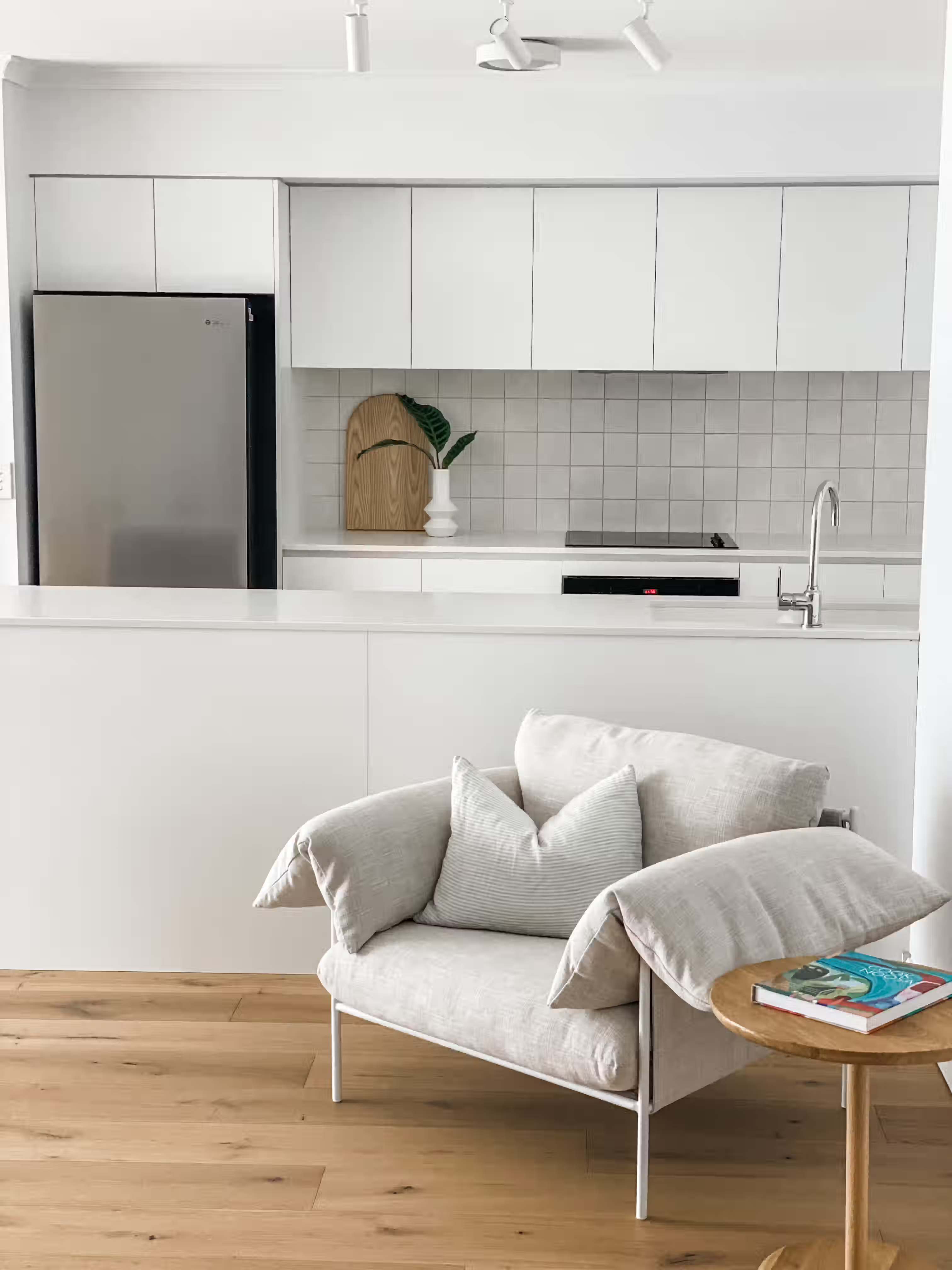
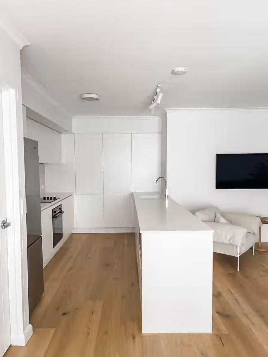
Our goal was to open up the space, so we went with white handleless cabinetry from Starkey & Christoe spanning to the ceiling (well, in this instance, a false bulkhead to make it look seamless), white engineered stone benchtops from Stone Ambassador, and a light neutral zellige tile from Beaumont Tiles for the splashback. Having the new flooring run right through, as opposed to having contrasting tiles like the original, meant a more seamless look that gave the illusion of a larger footprint.
We moved the sink from the far end of the kitchen to the island bench, as its original position - squeezed between two walls - felt dark and cramped. Now with the sink moved, we replaced its old location with the pantry and extra full-length cabinetry to span the full wall, which opened up the bench space beside the stove on the back wall.
The Bathroom & Laundry Renovation
To keep things cohesive and also budget-conscious, we decided to continue the same finishes selected for the kitchen through to main bathroom, master ensuite and laundry. These three spaces lacked natural light, so having the light cabinetry and stone stops made a huge difference to the overall feel.
We selected a large light grey tile for the floors and wrapped them up the walls in the bathrooms - again, for a streamlined look that was budget-friendly. We "zhuzhed" things up with some subtle feature lighting - nothing over-the-top, but still added some extra personality.
In the laundry we used the same gorgeous zellige tile for the splashback and added overhead cabinetry for extra storage to maximise the functionality in this small space.
Entry
Because this holiday home is part of a larger complex, we couldn't make any huge changes to the exterior of the apartment (aside from the front door) so our aim was to create a surprise as soon as you open the door - to make the best first impression possible.
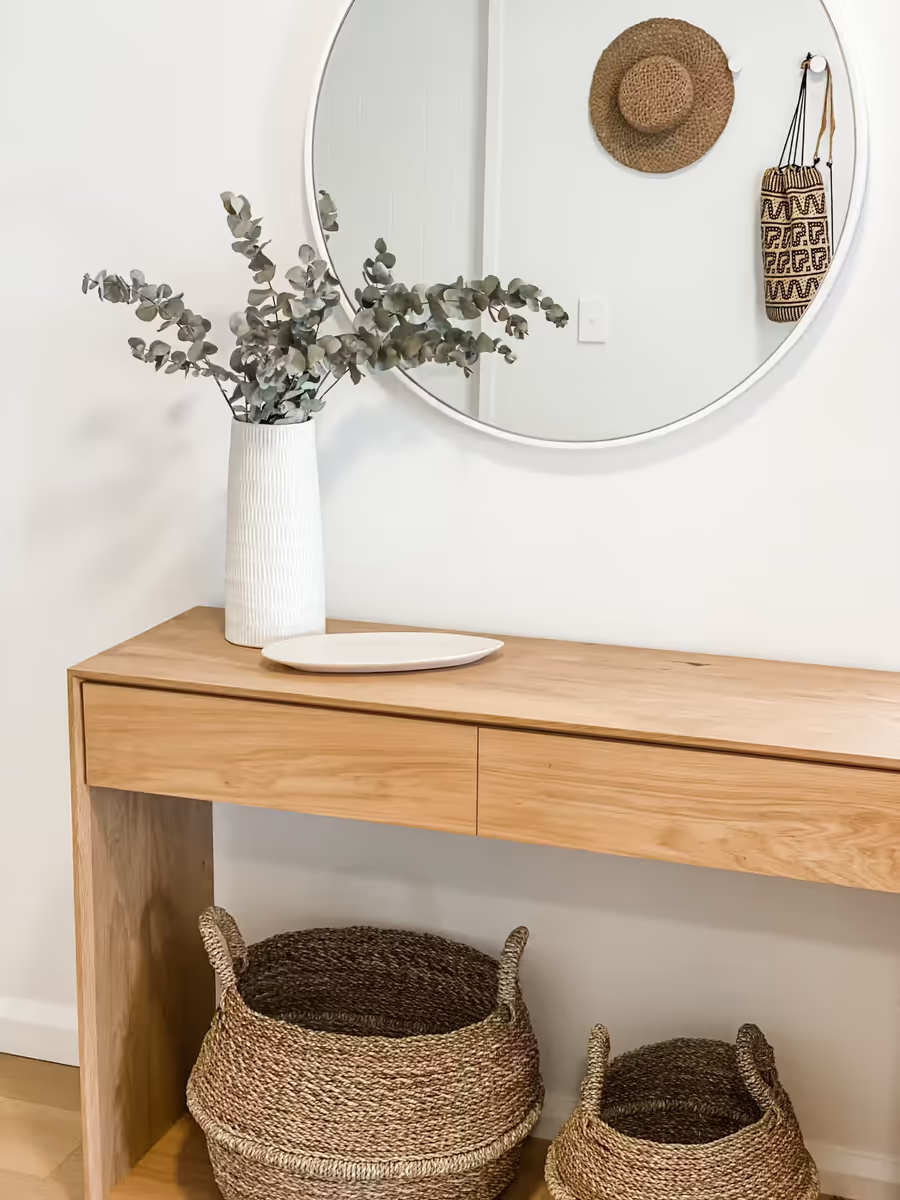
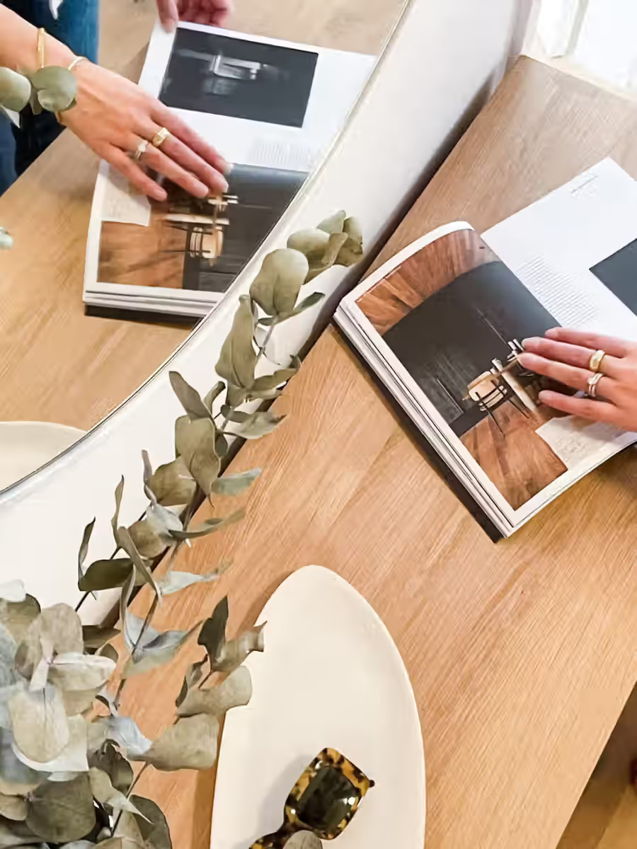
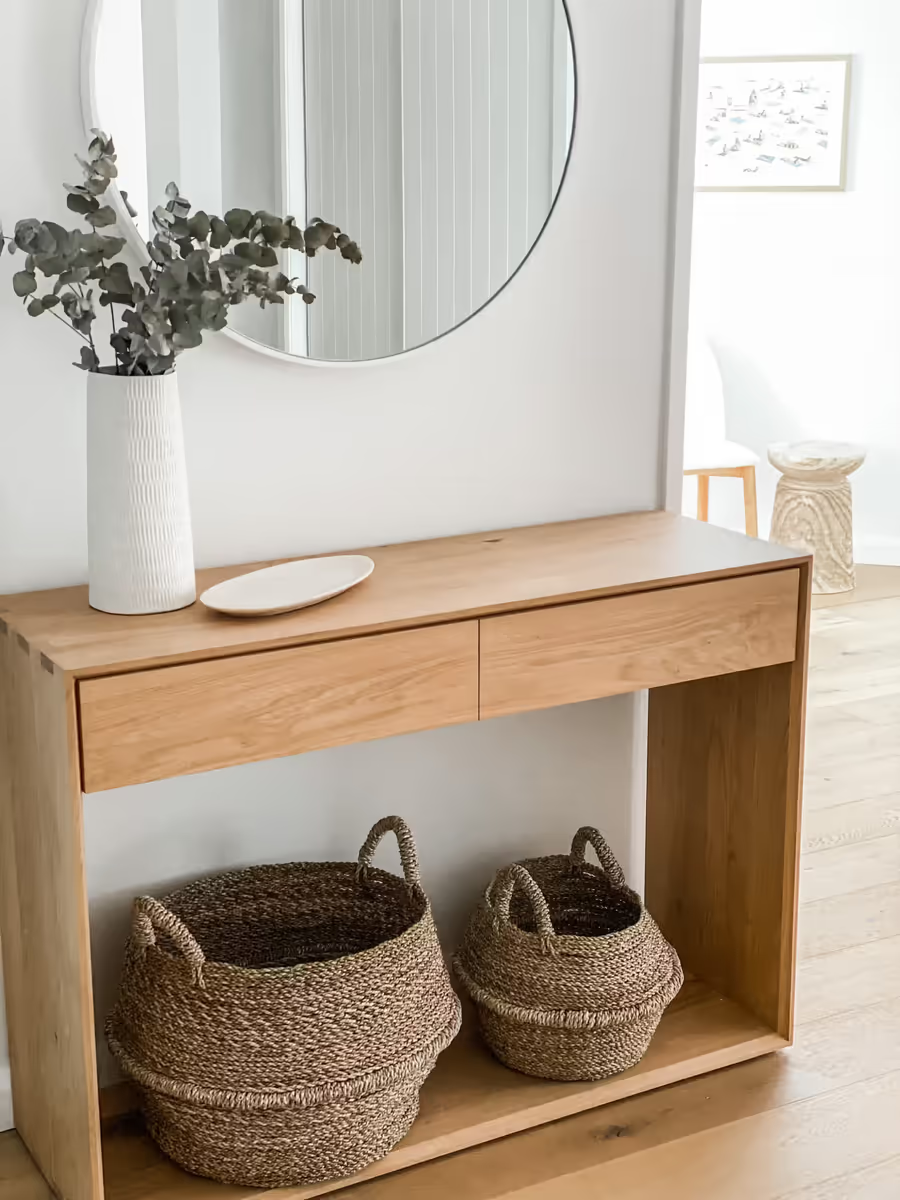
The design brief was for a minimalist look that didn't lack warmth, so we opted for this gorgeous Ethnicraft solid oak console table. We fell in love with the sleek lines, and the two drawers are the perfect practical element needed to store all the local guides you usually find at airbnb's or holiday apartments.
There was a noticeable lack of natural light in the entry, even with the revised lighting plan we put in place, so we thought an oversized mirror would make a perfect addition to help bounce light around the space. It also reflects the VJ door panels we replaced the old ones with, which we thought was a subtle way to add more texture and modernise the interior.
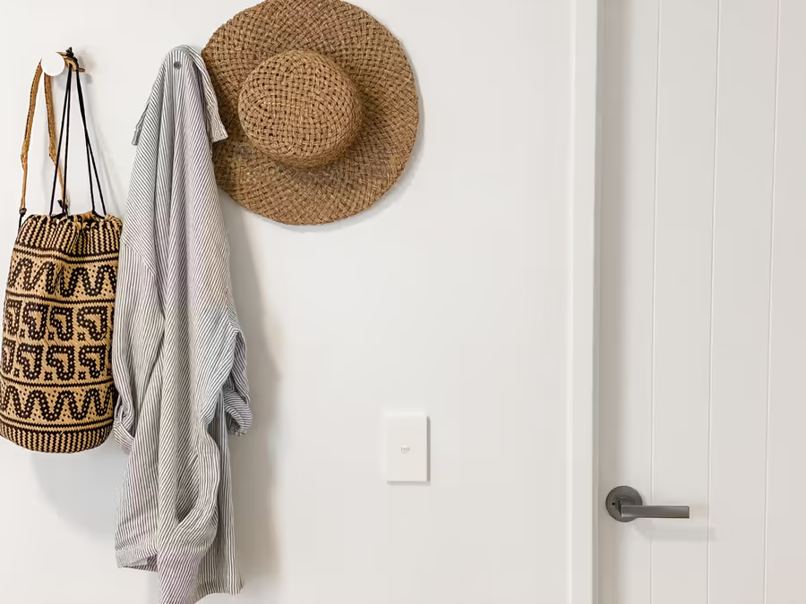
On the opposite wall we installed three minimalist wall hooks. This would be an easy spot to hang beach towels, but in the meantime we styled it with a woven bag, hat and a linen shirt - proof that every day items can still create a cool vignette!
Living and Dining Room
The living room: the heart of the apartment, where family and guests can chill out, entertain and connect with one another. This, we must admit, was a bit of interesting space.
The left hand side consists of angled walls - again, barely any room was completely square in this project - and because the entry opened up into this large open plan living, dining and kitchen, it was important we absolutely nailed which space went where.
The previous owners styled the space so that the dining room was first off the entry, followed by the living room closest to the balcony access. Because of the layout of the space, it meant that only a four seater dining setting could be accommodated - due to the thoroughfare created off the entry - and a lot of "dead space" to the right of it in front of the kitchen island.
With the living room setting positioned at the back, and because of the angle of the left wall, it meant that the sofa was angled in the direction of the kitchen, which made the entertainment unit and TV feel disjointed (think of all the stiff necks when it came to movie time!).
After some collaborative brainstorming with our lovely client, we ultimately decided to reconfigure the layout...
Having the spaces switched meant that the dining setting was in its own corner, opposite the kitchen access for ease. We opted for this stunning oak dining table by Ethnicraft with the matching bench seats to maximise bums on seats and eliminate any stresses when it comes to inevitable crumbs and spills. A pendant light was chosen to feature, not just for the added mood lighting (which helps create a relaxed ambience), but to also help ground that space.
We wall-hung the TV on the wall beside the kitchen so that a) it felt more out of the way, and b) the direction of the sofa - due to the angled wall - made sense, as it was now facing the TV. What used to be a "dead space" in front of the island bench was filled with a stunning Sarah Ellison armchair to morph the living room into more of a conversational space, as opposed to purely a TV-watching space.
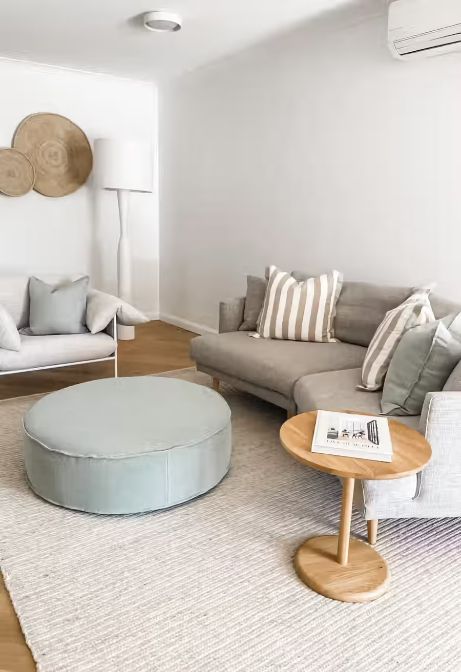
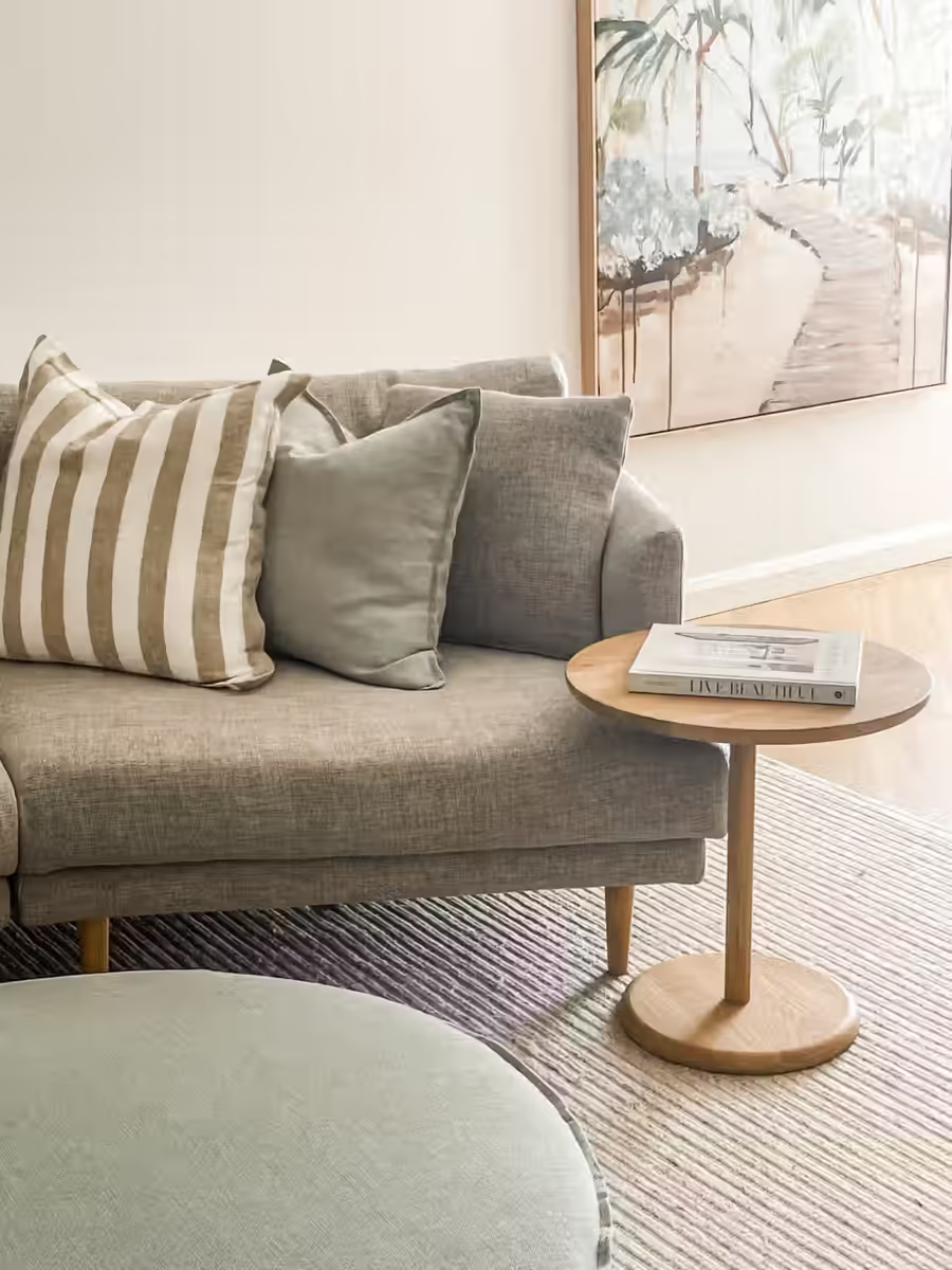
We took inspiration from all the angles and ran with it, selecting the Globe West Cuddle sofa (how perfect is that name though!) that helped emphasise the conversational set up seen in the new living room. Another Sarah Ellison Alva armchair was paired with the sofa, along with a floor lamp and gorgeous sage green linen ottoman. We incorporated this large-scale ottoman with flexibility in mind: it can be used as an ottoman to stretch out tired legs; as a coffee table with a tray for food and drinks; or moved around and used as extra seating.
The neutral woven wool rug from Weave helped ground the living room and add the softness needed to create a truly relaxing space to comfortably stretch out in. A huge Marcia Priestley framed artwork generously fills the wall to the side of the living room setting to play on the asymmetrical nature of this space, and can be enjoyed from every corner of the main hub of the apartment.
The Bedrooms
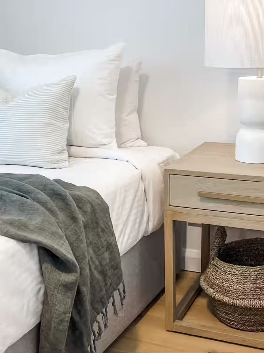
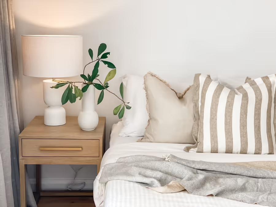
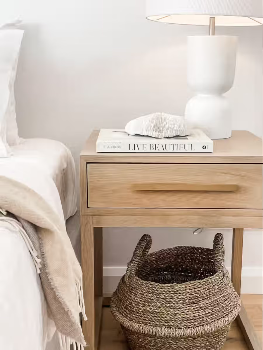
Our client wanted the bedrooms to mirror each other by using the same bedside tables and lamps, so the way we helped differentiate each room was by mixing up the decorative cushions and throws. We continued the muted palette seen in the living room through to the bedrooms for cohesion. Soft greens, blues and neutral tones were used to create tranquil spaces that embody the laid-back, relaxed vibe you get from a getaway to the beach. The beautiful light oak Globe West bedside tables reflected the timbers chosen in the main spaces, with the muted brass handle adding a subtle luxe touch.
The crispness of the white table lamp contrasts beautifully against the warmth of the oak bedside table, and also reflects the feature lighting in the dining and living room.
We hope you enjoyed this little step-by-step tour of one of our favourite renovations to date!