Journal
Colour Saturation When Decorating Your Home
March 26, 2024
Colour is one of the most important elements when it comes to home design and interior decoration. It helps communicate our personalities, and can even impact our moods and energy levels. It's easy to think of colour as just that - the colour: blue, green, yellow, etc. We find that when we're discussing colour with our interior design and home styling clients there's one thing that we always bring up during our consultations, and that is colour saturation.
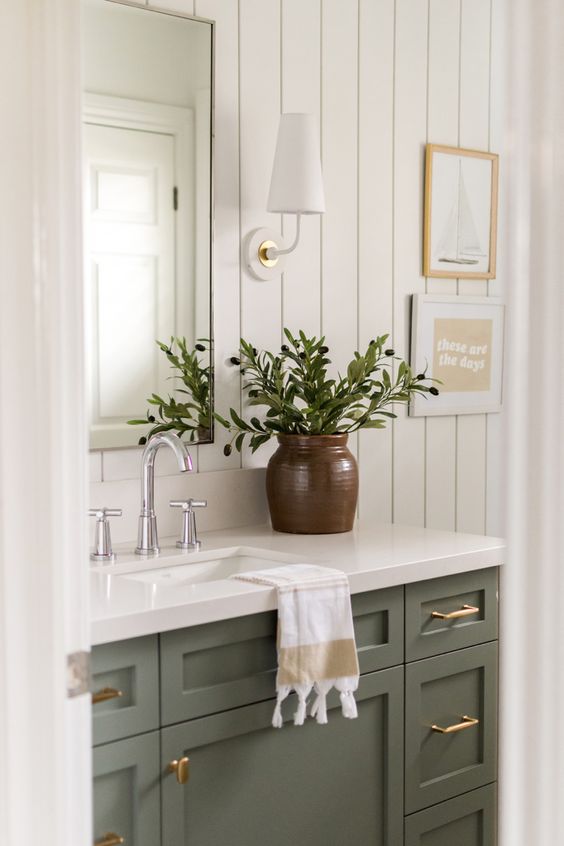
When we talk about colour saturation, we're talking about the intensity of the colour. Saturated colours are very vibrant, whereas de-saturated colours are softer and subtle. Take the below, for example. All of the photos feature a green colour palette, however they offer very different feelings between the examples.
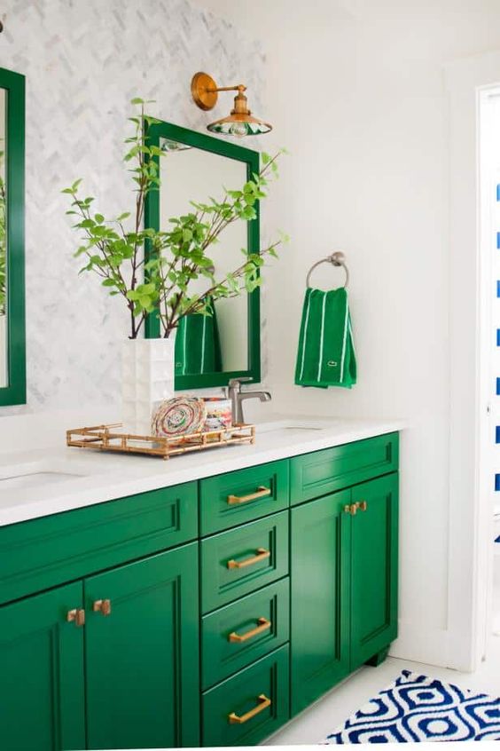
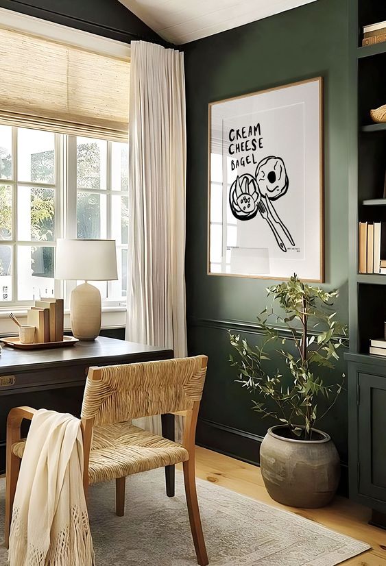
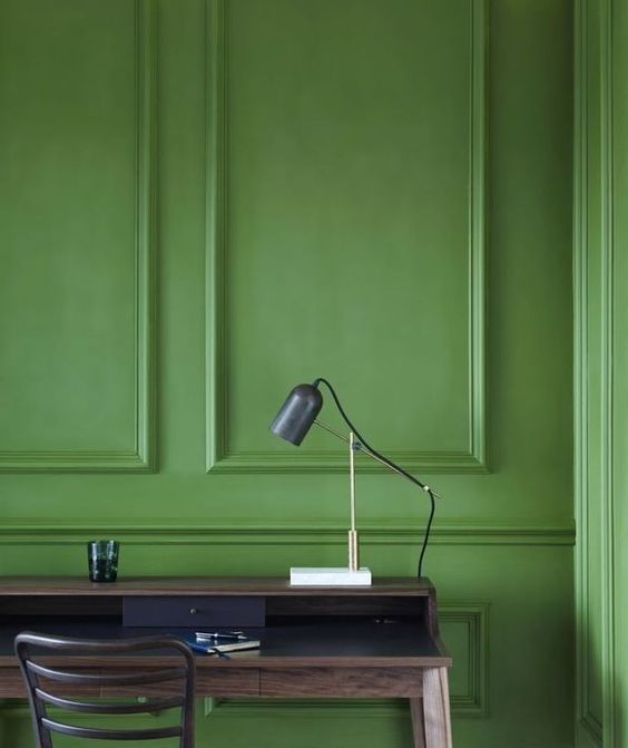
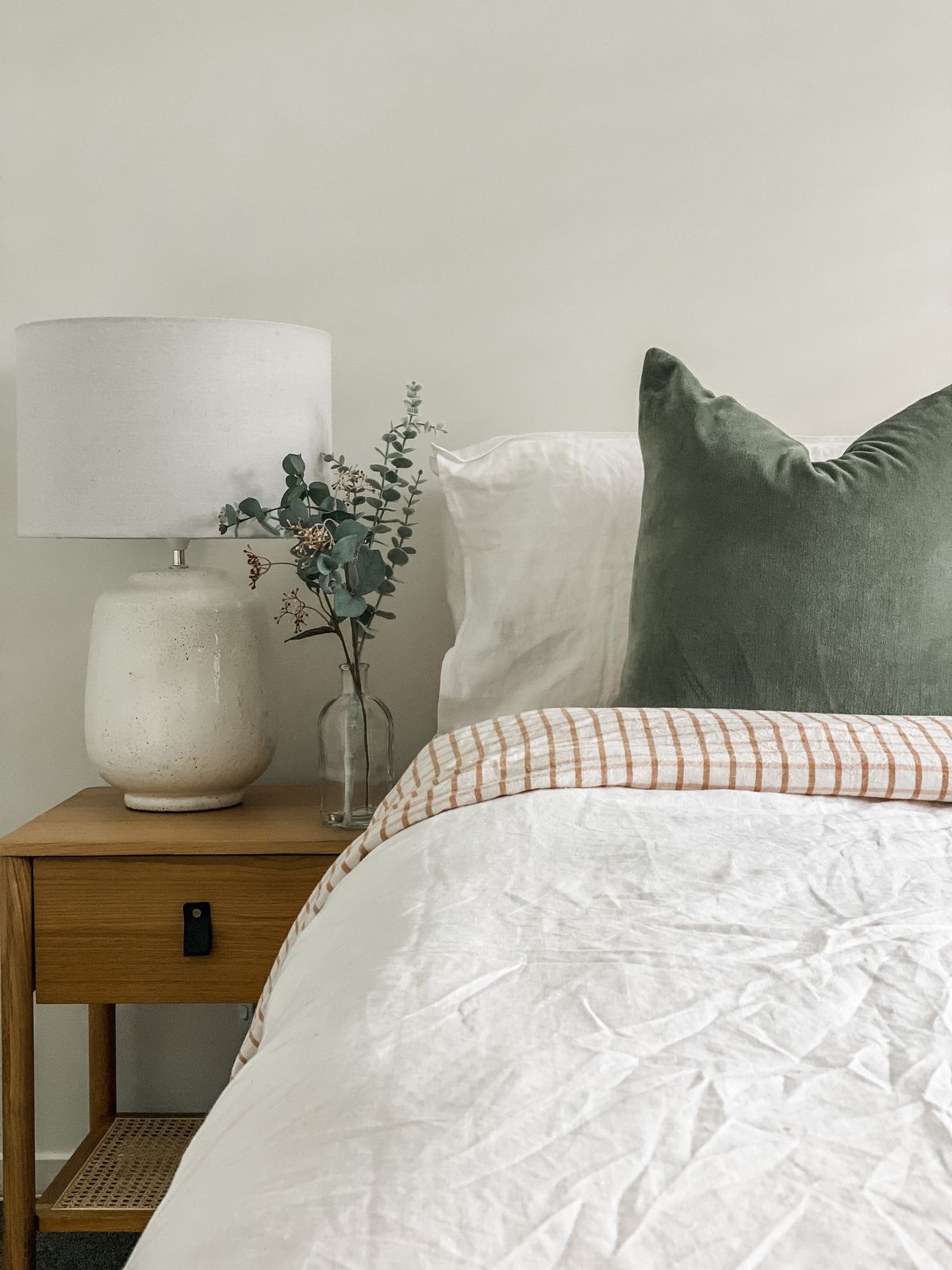
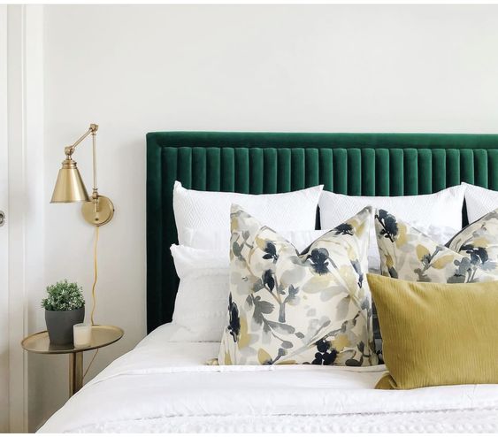
How would you describe the left-hand images and the right-hand images? We would describe one as relaxing, soft and calming; the other feels vibrant, loud, and energising. This is thanks to the saturation (or de-saturation) of the greens used, independent of the brightness. This means that even if you choose a light or a dark green in a de-saturated palette, for example, will still feel calmer than if you choose a light or a dark green in a saturated palette.
Just to really bring it home, here are some examples in blue:
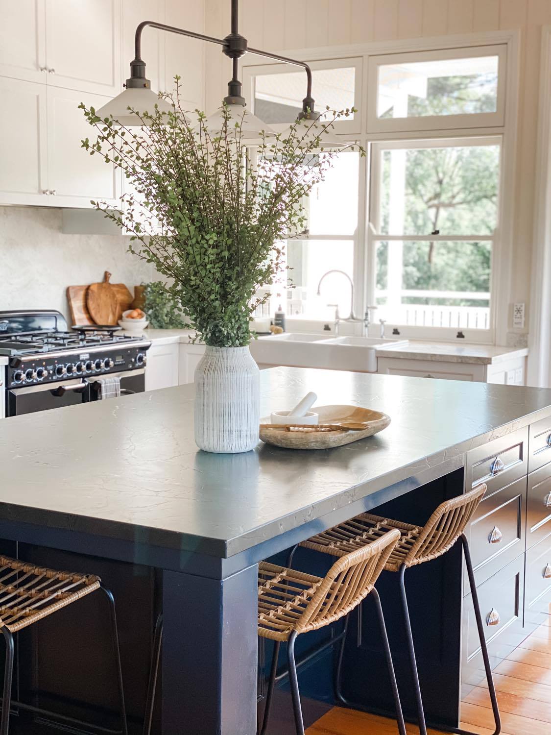
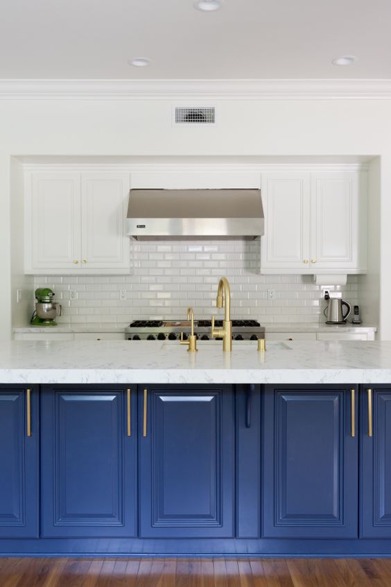
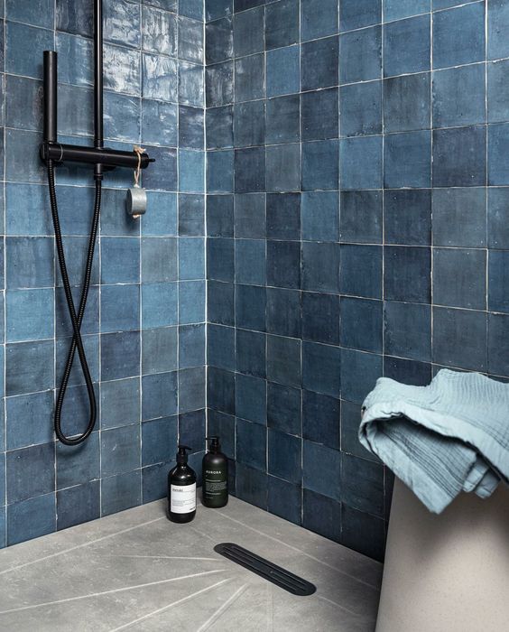
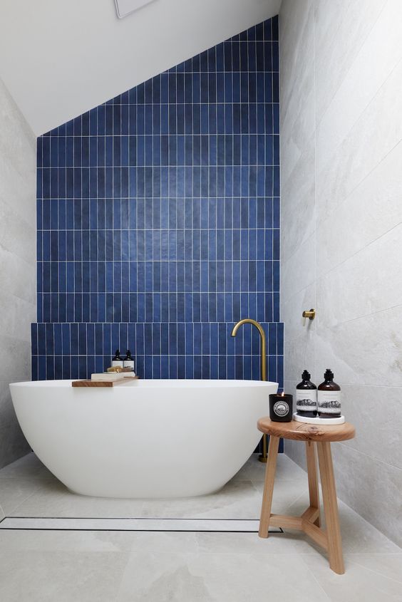
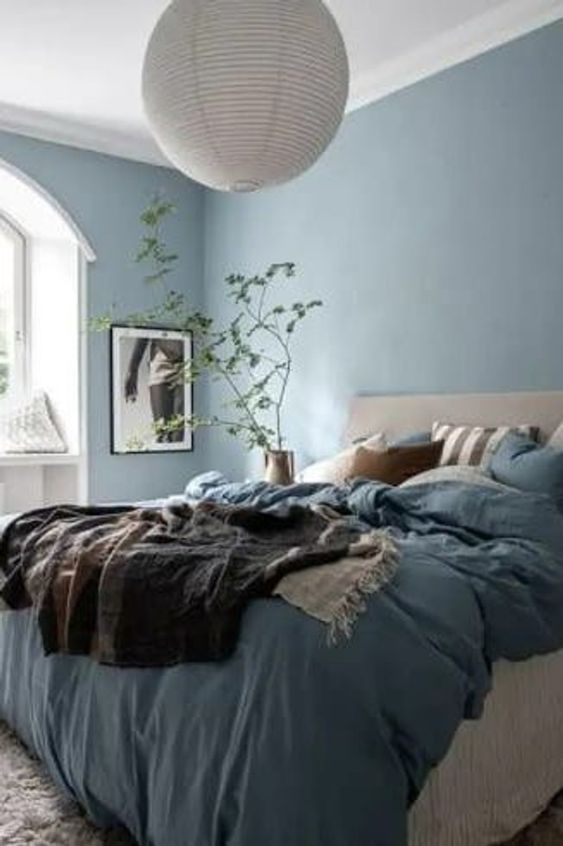
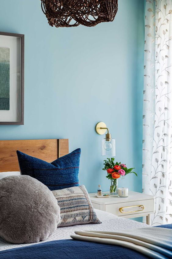
The more grey the colour, the less saturated it will be, so remember this when you're applying colour to your interior and how it makes you feel in a space. If you prefer a more calming interior, then perhaps de-saturated colour is more for you. Or maybe you want a mix of both? Something energising for the kids' playroom and something relaxing for their bedroom, but keeping it within a certain colour palette.
Hopefully this helps you understand the big impact these subtle differences can make. And if not, you know who to call!